

Some furniture gives away the year it belongs to at once; other pieces settle into their place better as time goes by. The style shaped between 1945 and 1970, which we now call mid-century modern, belongs to the second group. The calm grain of a walnut coffee table, an armchair rising lightly off the floor on slender legs, a wide pane of glass opening onto the garden. All are parts of the same idea.
The name was given to the period later and only became widespread in the 1980s. The designers of the time were less interested in establishing a style than in finding homes and objects suited to a changing way of life. The language that emerged was simple but not cold; it softened the order of modernism with the warmth of wood.
Rethinking the home after the war
When the Second World War ended, a great need for housing arose, especially in America. Newly formed families wanted smaller, more practical and affordable homes. Production techniques developed during the war years, from molded plywood to new adhesives, now turned toward everyday life.
Launched in 1945 by Arts & Architecture, a magazine published in Los Angeles, the Case Study House program became the symbol of this search. The aim was to have architects design model homes suited to postwar life. Charles and Ray Eames’s own house, completed in 1949, remains one of the most often cited examples of the period: although assembled from off-the-shelf steel and glass parts, it is a warm building that never wears on those who live in it.
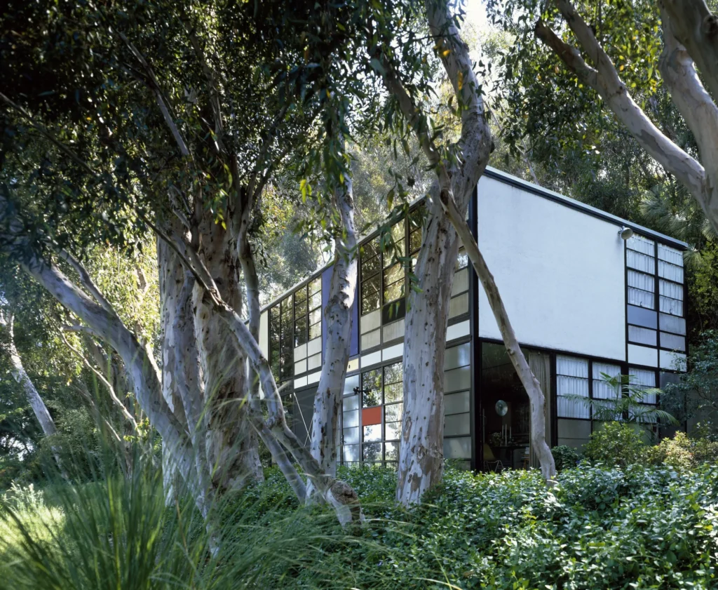
In these houses, the walls dividing rooms grew fewer; living, dining and work areas began to flow into one another. Furniture, too, was shaped by this new plan. People looked for pieces that were light, easy to move and tidy from every angle. Chairs became stackable, tables extendable and shelving expandable to fit the wall.
Walnut and teak: a warm modernism
Prewar modernism was often the language of tubular steel, glass and white walls. Mid-century designers kept that order but brought wood back to the surface. Walnut came to the fore in America, teak in Scandinavia. Both were warm-toned woods with pronounced grain; they kept their character even as a thin veneer.
Danish craftsmen mostly finished teak with oil and left its texture exposed. In the chairs of designers such as Hans Wegner and Finn Juhl, wood stands like a carefully carved sculpture, even at the joints. On the American side, walnut veneer brought a calm depth to broad, flat surfaces, cabinet doors and desks.
What these materials share is that they grow more beautiful with time. Oiled wood darkens with use, and small marks become part of the surface’s story. The idea of an object that ages along with its owner, rather than one expected to stay flawless, is perhaps the style’s most lasting legacy.
Organic lines, slender legs
The easiest way to recognize furniture of the period is to look at its legs. The body does not sit on the floor; it rises on legs that taper downward and often splay slightly outward. A gap remains underneath, light reaches the floor and even a small room looks more spacious.
Lines softened as well. Having worked with molded plywood during the war, the Eameses carried the same technique over to seating in the mid-1940s. The LCW chair, with a seat and back curved to meet the body, showed that wood could be fluid too. In the mid-1950s, Eero Saarinen tried to do away with the clutter of legs under the table with his Tulip chair, which rises on a single leg.
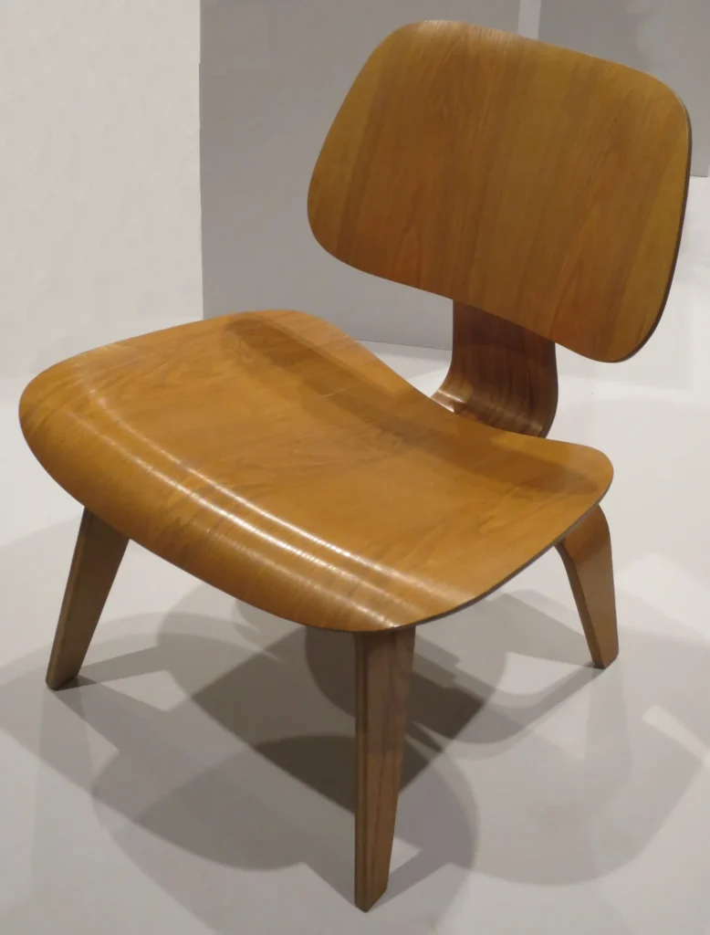
The organic quality here is not ornament but a result of use. The curve appears where the back makes contact, and the tapering begins where the load lightens. Even if the eye does not notice this logic, it senses it. That is why a good piece from the period still looks comfortable and natural years later.
Between inside and outside
Another thing mid-century houses have in common is that they bring the view inside. Wall-to-wall glass, sliding doors and the same flooring running from inside out onto the terrace make the room feel like an extension of the garden. Mies van der Rohe’s Farnsworth House, completed in 1951, is the purest expression of this idea. A single volume enclosed in glass on all four sides, it uses the surrounding trees almost as walls.
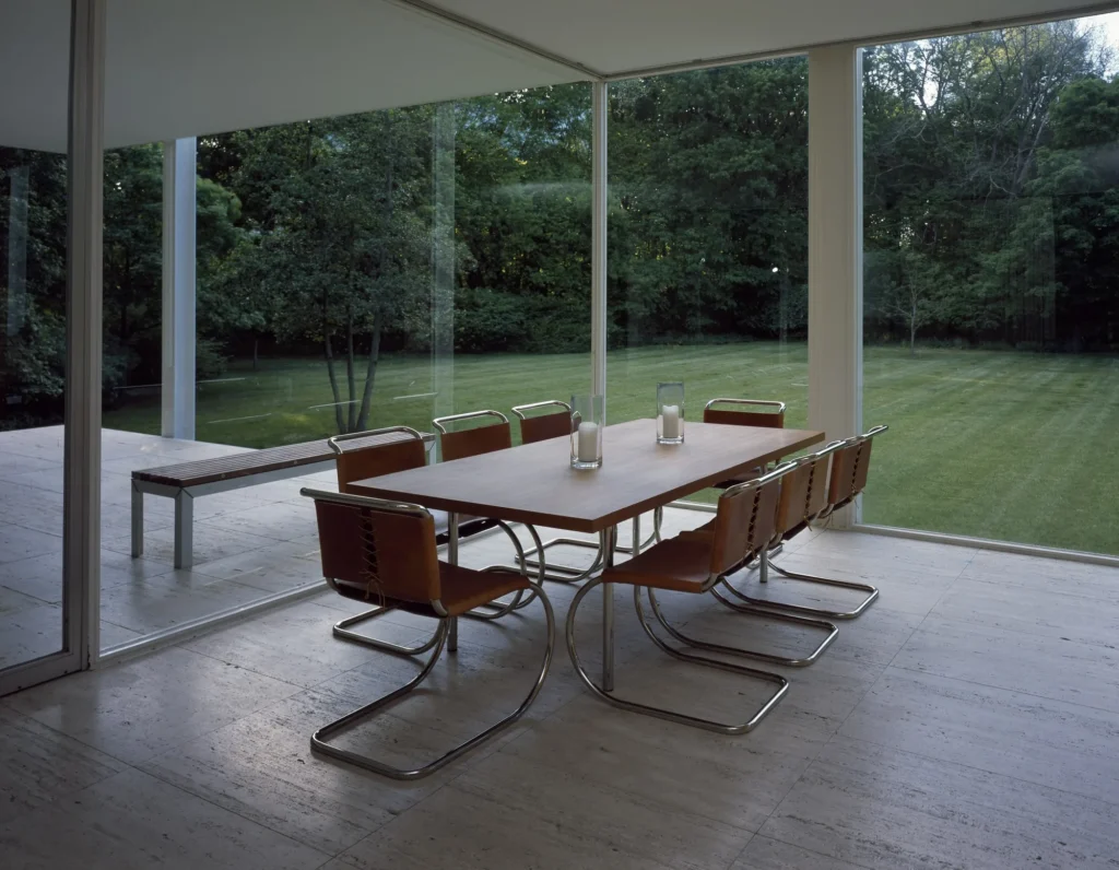
The Usonian houses that Frank Lloyd Wright designed from the mid-1930s onward had followed a similar path. Low ceilings, wood-clad surfaces and glass doors opening onto the garden made the interior feel both sheltered and intertwined with the outdoors.
This approach also shaped the choice of furniture. Low coffee tables that do not interrupt the view, armchairs the eye can see past and natural materials stopped being obstacles in front of the window and became part of it. Fabrics, too, often featured colors reminiscent of nature, such as mustard, olive green and earth tones.
Staying power in the home office and living area
Today, working from home is an ordinary part of daily life for many people. It is no coincidence that mid-century modern adapts to this need so easily. The designers of the period were already thinking of homes where people wrote in the living room and kept accounts at the dining table. The modular ESU storage units the Eameses introduced in 1950 were designed so that the same components could be used in different arrangements both at home and in the office.
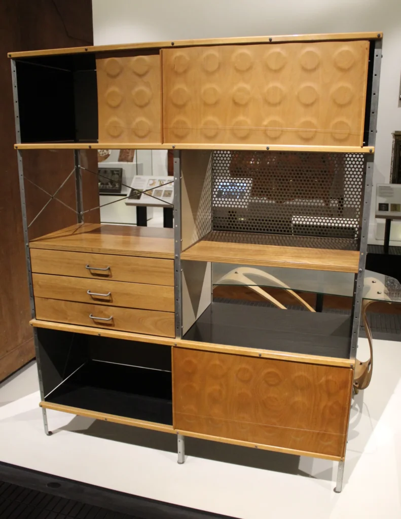
A desk on slender legs fits into a small corner without weighing down the room. A walnut surface leaves a place between screen and papers where the eye can rest. In the living area, a low coffee table, an armchair with wooden arms and a good reading lamp carry a whole evening with no need for show. When a bookcase or cabinet stands on legs instead of being built into the wall, the room remains a place that is both orderly and able to breathe.
The reason the style has lasted so long is that it offers a sense of measure more than a fashion. To bring it into today’s office or home, it is enough to follow the same order: first choose the warmth of wood, then keep the line simple, and finally leave room for the light in the space.