

When we hear the word minimalism, most of us picture an empty room, white walls, and a few pieces of furniture. That image is only the surface of the style. The real point is less about reducing possessions than about knowing why each remaining piece is where it is. When a table, an armchair, and a lamp earn their place, the room calms down on its own.
Living with fewer things does not have to create a sense of deprivation. A well-designed minimal space takes away the noise that scatters attention and puts light, material, and proportion in its place. That is why the style suits not only white galleries but also an office where people work every day and a home that is lived in.
Less, but essential: the roots of the style
The word minimalism became widespread in the art world in the 1960s and was used for artists who reduced sculpture and painting to the simplest geometric forms. In architecture, however, the traces of this thinking go back further. The phrase “less is more,” associated with Mies van der Rohe, one of the pioneers of modernism, sums up the idea of setting ornament aside and bringing the structure itself, its proportions, and its materials to the fore.
Two of the best-known examples of this idea were completed within a few years of each other. Philip Johnson’s Glass House in Connecticut was finished in 1949, and Mies van der Rohe’s Farnsworth House in Illinois in 1951. Both are single-volume buildings enclosed in glass on all four sides, with almost no interior walls. The sliding panels, simple rooms, and uncluttered arrangement of traditional Japanese houses also influenced many modern architects.
The value of empty space
In a minimal space, emptiness is not seen as a gap waiting to be filled. The area left around a piece of furniture makes its form legible, defines the path of movement through the room, and leaves the eye a place to rest. An armchair set against a wall and one standing in the middle of the room with open space around it speak differently, even if they are the same piece.
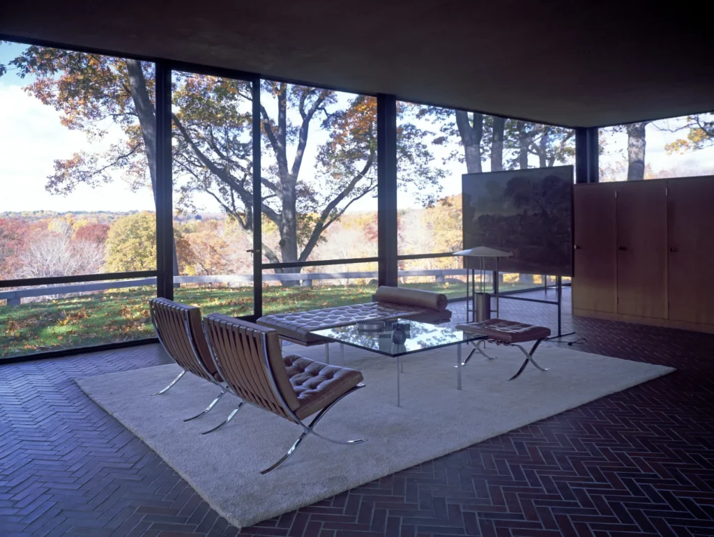
The living area of the Glass House is a good example of this thinking. A few armchairs and a coffee table are gathered on a single rug, whose edge defines the area like an invisible wall. The rest of the floor is left empty, and this emptiness becomes one of the strongest elements in the room.
In an everyday space, this means not covering every surface with objects. A wall left completely bare or a single chair standing alone in a corner may look like something is missing at first glance. After a few days, though, the room begins to feel more spacious, more orderly, and calmer.
The relationship between light and surface
When there are fewer objects, light becomes more visible. Window light that shifts direction throughout the day works like a decoration in its own right on a bare wall. That is why, in minimal interiors, curtains are usually kept light, the areas in front of windows are left clear, and tall furniture that would block the light is moved to walls away from the windows.
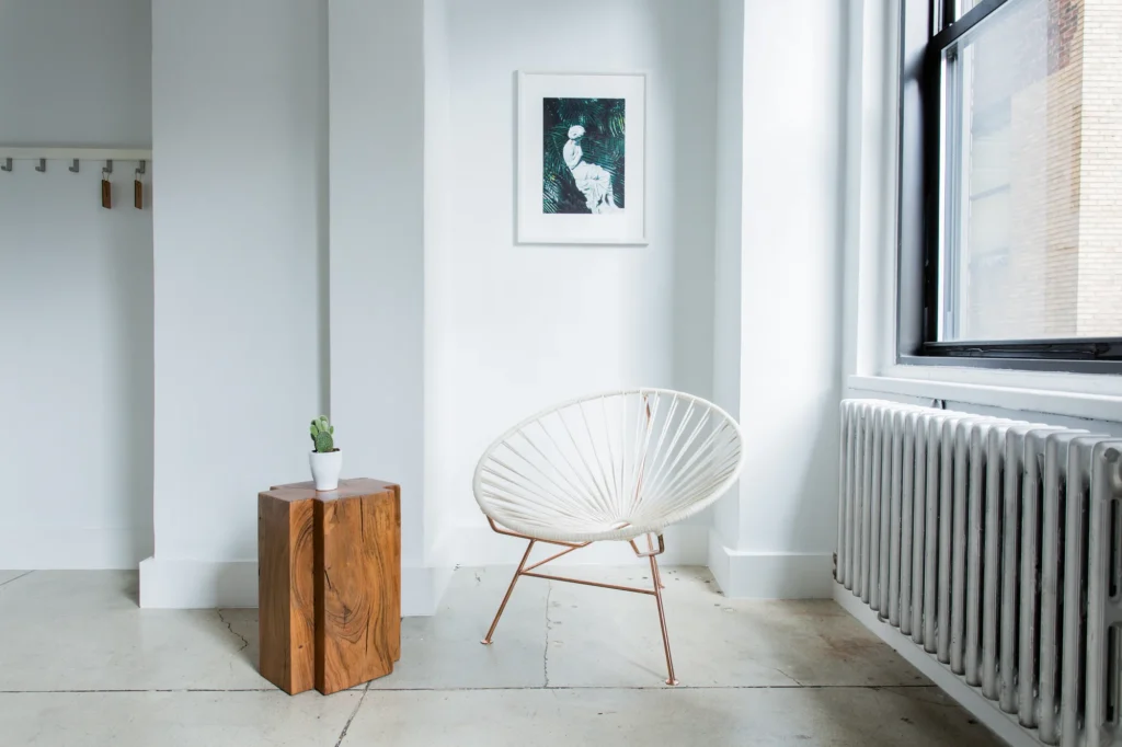
The choice of surfaces also determines how light behaves. Very glossy finishes tire the eye with their reflections, while matte and semi-matte surfaces soften and diffuse the light. Light-toned walls brighten the room, and natural textures such as wood, stone, and felt add warmth to the space. Minimalism is often found cold precisely because this balance has not been struck.
The same measure applies to artificial lighting: a small number of well-placed sources. A concealed light strip, a table lamp, and a ceiling light that illuminates the whole room evenly are enough for most spaces. Keeping the color of the light in the warm white range also prevents light-toned surfaces from looking cold and dull.
Hidden storage and quiet surfaces
In a minimal room, things are still there; they simply are not on display. What holds the style’s order together is well-thought-out storage. In a traditional Japanese house, the beds are put away in wall closets during the day, and the room becomes an empty, multipurpose space again. This habit captures the essence of minimal living in a simple way.
In the Farnsworth House as well, the kitchen, bathrooms, and services are gathered in a wood-paneled core at the center. Storage is not spread along the walls; it is resolved in wooden blocks that stand within the room, with handles that do not catch the eye. This keeps the inside of the glass shell open, while the wooden masses take on both the function and the warmth of the space.
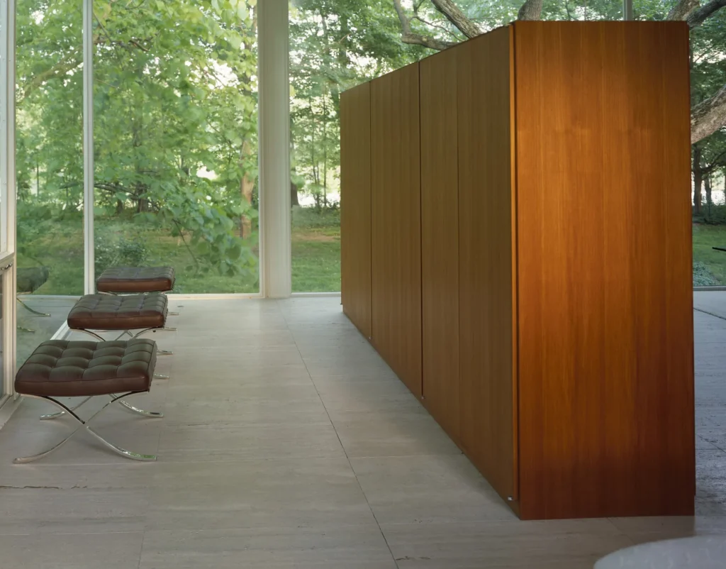
This is exactly what we mean by a quiet surface: a surface that does not call attention to itself but reveals its care when you look closely. Handleless or recessed-handle fronts, fine joint lines, a single wood veneer, and consistent colors reduce the places where the eye snags. A good cabinet, when closed, stands as calmly as a wall.
Minimal order in the executive office and at home
In the executive office
In an executive office, minimalism establishes authority through order rather than display. A large but simple desk holding only the few objects needed that day, a cabinet with doors behind it, and two comfortable armchairs for guests are often enough. Once files, cables, and devices are put away behind doors, the desk stops being a pile of paperwork and becomes a surface devoted to thinking and making decisions.

In the choice of materials, too, the rule is fewer but better. When a wood with a pronounced grain such as walnut, an anthracite metal base, and a leather-upholstered chair come together, there is little need for any other ornament. Repeating two or three materials in the room makes everything look as if it belongs together.
At home
At home, the aim of the style is to make life easier, not harder. Leaving enough room to move comfortably around the seating in the living room, keeping the TV unit low and closed, and leaving the dining table clear are small but effective steps. As decorative objects become fewer, each of the remaining ones gains more meaning.
Whether in an office or a home, minimal order rests on the same simple question: Should this piece be here? Asking this question again with every new item, combined with cabinets that keep order behind their doors and seating with simple lines, creates a lasting calm in both the executive office and the home.